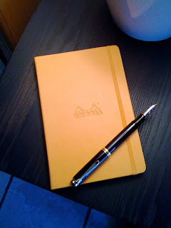

For a long time I have happily used for my journal writing a Japanese made ‘notebook’ called Life Noble Note Plain. I like the size of five and a half inches by eight and a quarter inches, as well as the thick unlined ivory pages. I also like the brown cover with its old-fashioned design. Several months earlier, at the time I was living in Japan, but making plans to leave there, I bought five of the Life notebooks to take away with me, certain I would be unable to find the same brand here in the US. But that stack of five has dwindled, and I’ve had my eye out lately for a replacement.
And then came Rhodia. I read a couple of reviews on pen & paper related blogs of the new Rhodia Webnotebook. It looked good and right off impressed me as a likely replacement for my longtime Life notebooks. I’ve had good experience with Brian Goulet at gouletpens.com, so I ordered from him the larger of the two Rhodia Webnotebooks, which just happens to be the exact size of the Japanese Life notebook I’ve always used.
My order arrived amazingly fast, and as is usual with Brian, included a handwritten note of thanks for my order, finished off with a wax seal. To my mind, the note is a special touch. But to the point, the Rhodia ‘Webbie’ as it has come to be called…
I chose the orange (tangerine) cover because I wanted to expand my range of colors, journal-wise. The Rhodia orange is beautiful, but it isn’t until you hold, touch and feel the Italian leatherette cover that the color comes into full bloom. The best way to describe it is to say it is something I want to hold onto. It feels good in my hands, and moving my fingers over the leatherette is almost a soothing sensation. It certainly makes me wonder what exactly this ‘Italian leatherette’ is. The Rhodia logo in the center complements the notebook’s softness.
Another thing I like is the rounded corners. No matter how you turn or hold the Webbie, there are no sharp edges. Everything about it is smooth and silky, and that includes the 90g ivory Clairefontaine pages inside the cover. The Clairefontaine name is enough to tell you that the paper is going to be of superior quality. The Webbie has 96 blank (or lined) sheets, or 192 pages. The paper is acid-free, pH neutral and PEFC-certified.
One add-on at the back is a great idea, one I’ve seen in Japanese notebooks. This is an inner pocket just inside the back cover, perfect for small notes or clippings, maybe business or personal cards, things you want in a journal that aren’t written on the pages.
The notebook also has an attached elastic band which offers protection from other things getting wedged in the pages while in your bag; a simple band that keeps the book closed when you want it closed.
So what about the paper inside, the Clairefontaine 90g? Hard to imagine that anyone could ask for better. For my first bit of writing I chose five different fountain pens and five different inks. Each one proved to be a beautiful marriage of ink and paper. Smooth, clean, no feathering or bleed through, satisfying in all its qualities—what I would call ideal or perfect for pen and ink.
PENS AND INKS USED
Lamy 2000 (M) • Sailor Blood Orange ink
Lamy Safari (M) • Waterman Florida Blue
Pelikan 200 (M) • Sailor Miruai
Pelikan Souverän 600 (M) • Iroshizuku Tsukushi
Pelikan Souverän 1000 (BB) • Montblanc Violet
It’s just a matter of time until I order my next Rhodia Webnotebook. I’m hooked.
My thanks and appreciation to Brian Goulet at gouletpens.com.


