Showing posts with label Japanese Art. Show all posts

Friday, February 27, 2015

Brushstrokes

From the early 1880s, as Japanese painters began finding their way to Europe and beyond, they brought back to Japan on their return the Western influences that in many ways modernized the Japanese tradition. The practice of careful observation and sketching from nature was ultimately combined with contemporary Western painting practices and led to an innovation in the nihonga style of painting.

One of those who returned from Europe with new ideas was Takeuchi Seihô, considered by many to be a leading modern nihonga painter.


Takeuchi Seihô (1864-1942) was born in Kyoto and even as a boy loved drawing, leaving little doubt he would become an artist. At the age of sixteen he began studying traditional painting with Kôno Bairei, a well-known master of paintings depicting birds and flowers. Two years later, in 1882, two of Takeuchi’s works received awards at a prestigious painting competition and that was enough to launch the young artist’s career. He made a European tour in 1900 where saw the Paris Exposition, visited art schools and made the acquaintance of Western painters. The young man’s greatest impressions came with the work of British painter, J.M.W. Turner and the French, Jean Baptiste-Camille Corot. After his return to Japan Takeuchi developed a style combining the realism of traditional Japanese painting with Western realism as he saw it in the techniques of Turner and Corot. Takeuchi’s new style became one of the principal principal influences in modern nihonga. Though noted for his landscapes, the artist more often turned to drawing animals in amusing poses and it is in those drawings that we see his commitment to capturing sometimes in only a few brushstrokes the essence of his subject.

Easy enough to count the brushstrokes in a drawing that perfectly captures horse and movement.

One in a series of twelve animals from the Zodiac; done sometime in the 1920s, this painting is good example of the artist’s whimsey.


Striking in this large work covering two six-panel screens is the precise anatomy and musculature of the immense animals. Note the monkey perched on the back of one, reaching for the birds in the top left; notice too the eyes of the elephants. Painted in 1904, the work is in black ink on gold paper.

A very different example is the oil painting Suez Landscape painted in 1901 after the artist’s return from Europe. The work is based on a postcard from the collection he gathered while abroad. The influence of Turner and Corot is obvious in this landscape, especially in the palette and the painting of the water.


Most striking in this undated ink and color painting is the use of space. The artist has placed the focus in the lower right, leaving a broad and largely blank space. The red and black in that large space is Takeuchi’s seal and signature. Once more the touch of humor is there with the inquisitive rat.

Simple but impressive watermelon; undated


Seals and signature used by the artist

Saturday, November 22, 2014

Rain & Snow: Kawase Hasui

Sometime in the early 1930s, a young man named Robert Muller noticed a woodblock print in a New York shop window and went inside for closer look. He ended up buying the print, using his meager monthly student allowance of $5. The print was Kawase Hasui’s 1931 work, Kiyosu Bridge. Later in his life, Muller opened a print and framing shop in New Haven, Connecticut and became an astute collector who over the years stimulated renewal and development in the art of Japanese woodblock printing.

One of the blogs I always look forward to reading celebrates the old shitamachi district of Tokyo and is written by a young South African woman living and working there. My great enjoyment in her writing (and photos) comes from the fact that I lived in Tokyo myself for 28 years, yet never fail to learn something new in blogposts from Rurousha. A week ago her post opened with a photo of Kawase Hasui’s woodblock print, Kiyosu Bridge. The artist’s name was not new to me and in line with other Japanese art posts I’ve done, with encouragement from Rurousha it seemed a good time to devote some space to this woodblock print artist of the late 19th and early 20th centuries.


Kawase Hasui (1883-1957) was a leading figure in the shin-hanga, or ‘new prints’ movement of Japanese woodblock printmaking. As a young man he studied with Kaburagi Kiyotaka, the man who founded the shin-hanga concept. Hasui traveled frequently, filling sketchbooks with drawings of scenic places around Japan. Many of his print designs are based on his watercolors, many of them done a year or two before the appearance of a first print, but in some cases years, even decades passed between the original work and the print version.

A Tea Plantation, 1941; watercolor in preparation for a woodblock print

Most of Hasui’s prints appear to be based on beautiful, atmospheric watercolors, probably done on location. His sketchbooks include what look like preparatory sketches for either a watercolor or print but it is hard to say much definitively about his creative process as it remains somewhat shrouded in mystery, and for now at least, lacking in very many substantiated facts. Through his teacher Hasui met Shôzaburô Watanabe, a driving force behind shin-hanga printmaking. Watanabe ultimately published most of Hasui’s work.

Daimotsu, Amagasaki in the Rain, 1940

In the print above we see not an old rural Japan but the blossoming industrial Japan of Hasui’s day. Despite that, it is an unmistakably Japanese setting.

Hasui is highly regarded for his exquisite color, perspective and ambiance in a wide range of woodblock prints. Over his lifetime he created over 600 different prints and is recognized as one of most prolific shin-hanga artists of the period. In 1953, the Japanese government decided to commemorate traditional printmaking and commissioned Hasui to make a special woodblock print. The result was Snow at Zojoji Temple, a work later designated an Intangible Cultural Treasure. The year before his death in 1957, Hasui was named a Living National Treasure in Japan.

Snow at Zojoji Temple, 1953

Pond at Benten Shrine in Shiba, 1929

The Road to Nikko, 1930

Cloudy Day, Mizuki Ibaragi, 1946

Mandarin Ducks, 1950

Night Rain at Kawarako, Ibaragi, 1947

Dahlias, 1940

The print of Dahlias, along with Mandarin Ducks above are examples of Hasui’s few non-landscape compositions.


For more about the art of woodblock prints see an earlier post here.

Saturday, April 28, 2012

The Art of Rakusan Tsuchiya


Japanese woodblock printing reached a pinnacle during the country’s Edo period from 1603 to 1867 with the genre we know as ukiyo-e, or ‘pictures of the floating world.’ After western influence entered the country in 1867 woodblock printing went into decline. In the early twentieth century artists were more interested in the concept of sosaku-hanga, or 'creative prints, which allowed for more personal expression, more freedom in subject matter.’ In spite of these creative differences and the use of a new term to categorize the art, woodblock printing was still a visible genre in the country’s art. During the first quarter of the twentieth century Rakusan Tsuchiya enjoyed a vigorous period of popularity as a woodblock artist.

Painter, woodblock print artist and printer, Rakusan was born Tsuchiya Kôzô in Hyogo Prefecture in 1896, his family moving to Kyoto while he was still a child. He showed a talent for painting as a boy, and with no introduction from influential supporters, his family still managed to get him accepted as a student of Kyoto’s most famous painter of the day, Seiho Takeuchi. After seven years with the master, Rakusan opened his own studio. During the 1920s and 30s he printed and sold his work from his studio until it was disrupted by World War II. In the 1950s his work was sold in the US by Walter Foster. Rakusan’s best known work is a series of 100 woodblock prints done between 1925 and 1929. The work is called Rakusan Flower and Bird Print Series and became so popular the artist went on to print second and third editions. He died in 1976.


This rough sketch from a Rakusan sketchbook was done between 1929-31 and later reworked into a color print. The flower in the sketch is recognizable as a Japanese iris which would be purple in the final print. The artist eventually destroyed his sketchbooks and without any available notes the bird is difficult to name.


Considered by the artist to be one of his best prints, and titled Tawny Daylily and White-winged Widowbird (Early Summer), this woodblock print was produced in 1930 from an original painting on silk. The day lily was originally a Chinese import, but it has been naturalized for centuries in Japan. The white-winged widowbird is an exotic African species often kept in aviaries.


Titled Dead Tree with Scarlet Kazura Vine and Laughing Thrush (Winter), this woodblock print was also the result of an original painting on silk dating from the late 1920s. The laughing thrush is not native to Japan and would have been an exotic caged specimen. Visible here are three small uncolored areas right of center, bounded by the vine growing above the branch—evidence that the woodblock was improperly carved.


Winter Birds Upon a Plum Tree (1930)


Cuckoo and Bracken (Early Summer) 1930


A few of the seals used by Rakusan


A photograph of Rakusan in his Kyoto studio, seated in the foreground

Wednesday, December 28, 2011

Autumn Grasshopper

Japanese woodblock printing in its early days required three people: an artist to draw the design, a woodcarver to cut the blocks, and a printer to color the blocks and make the finished prints. Over the years techniques and styles evolved and by the beginning of the twentieth century artists had begun to view the genre as stale and lacking vitality. A group of print artists debated the problem and decided the artist must do the work of designing, carving and printing, carrying the design through singly from concept to completion. A new term was devised to describe this kind of art—sôsaku hanga or creative print.


The Modern Japanese Print: An Appreciation is a 1968 reprint of an earlier limited edition book published in 1962. James Michener wrote the book’s accompanying text which explains how ten prints were selected by a panel of judges from the work of 275 artists. Each of the ten artists selected received payment for their work and were required to submit 510 copies of the chosen piece, keeping ten copies for their own files and finally destroying the original woodblocks. A copy of the original 475 folio limited editions of The Modern Japanese Print: An Appreciation released in 1962 would today be a valuable addition to any collector’s library.


An example from the 1968 first popular edition of the book was featured in Scriblets last July. That post featured the work of Maki Haku in a print titled Ushi (Ox). The prints of three other artists included in the book appear below.


Maekawa Sempan (1888-1960)

Son of a shopkeeper in Kyoto, Maekawa Sempan went to Tokyo as a young man to study art. His first job was drawing cartoons and illustrations for a satirical magazine named Pakku (Puck). Maekawa exhibited his first print in the sôsaku hanga style at the age of 31. He said of his own problems, “It took ten years to learn technique. Later, when I got acquainted with other artisans I found out they could have taught me the same things in a few hours.”


At the close of World War II things got better for sôsaku hanga artists and Maekawa was able to make a living on his prints. A favorite subject was scenes from Japanese hot springs and he published several series titled Hot Spring Notes. His popularity increased with colorful designs of ordinary people at festivals, as well as scenes depicting local customs and observations from life in the countryside. With the exception of a few linocuts, Maekawa worked exclusively with woodcuts, never displaying interest in Western techniques. His style, especially after the war was decorative, cheerful and colorful.


Rampu (Lamp) by Maekawa Sempan, 1960-61


The artist’s comment: “Autumn is my favorite season, particularly early autumn when the first cool days come around. In this print I fetched from my childhood memories of autumn days one of the lamps that we used to use and then perched an autumn insect on it.”


Mori Yoshitoshi (1896-1992)

For most of his life Mori Yoshitoshi worked as a textile designer and only began creating art prints at the age of 57. Born in Tokyo and trained at the Kawabata School of Fine Arts, after graduation he became a textile designer and dyer of kimono fabrics. Mori preferred earth colors as well as idealistic subjects taken from folk art, kabuki theater or characters in Japanese mythology, designs often humorous and expressing dynamic movement.


The artist enjoyed incredible energy in his later years. From the late 50s until the end of his life he exhibited regularly in Japan as well as abroad. Prints by Mori hang in major museums worldwide, including the Tokyo Museum of Modern Art, the Museum of Modern Art in New York, the Barcelona Museum of Arts and the Boston Museum of Fine Arts. His works are today rather rare and high priced.


Kagura no doke (Kagura Buffoonery) by Mori Yoshitoshi, 1960


The artist’s comment: “This work was inspired by the comic kagura dances given at Shinto shrine festivals throughout Japan. The dancers come onto the stage, generally a roofed outdoor platform in the shrine precincts, and to the accompaniment of the traditional drum and flute give hilarious pantomimes, which are also known as fools’ dances. The idea for this print came from my fond childhood memories of such fools’ dances.”


Kinoshita Tomio (1923- )

Inspired by the work of Un’ichi Hiratsuka and self-taught, Kinoshita began making prints at the age of 32. He startled the Tokyo art world in 1957 with a series of large prints done in a striking new style. The prints were of stylized human heads in only black and one other color. Both critics and buyers were impressed and a new artist was launched. Kinoshita cut many of his blocks entirely with a single cutting tool, either a flat chisel or a U-shaped gouge. He used the gouge to cut jagged parallel lines to define shapes such as the faces and bodies of partly abstracted human figures and to resemble the grain of wood.


The chief characteristic in the print shown here is the jagged lines which the artist used to convey the sense of woodgrain, an artistic invention that turns out to be better than realism. It was carved on two Judas tree boards and printed on natural color torinoko paper, a permanent type made from natural fiber; printed with carmine and vermilion watercolors to achieve the orange, and sumi ink for the black. Kinoshita made three impressions of the orange, and two for the black.


Kao 3 (Faces No. 3) by Kinoshita Tomio, 1959-61


The artist’s comment: “A full title for this print would be ‘Faces of the Weak Courageously Attempting to Move Forward in a World of Darkness.’ This is one in a series of prints I have been working on for four or five years, all having the common motif of faces or masks. In combinations of faces such as the present I am trying to express the sufferings of society, of man, of mankind, of all living beings. I am not too certain of my results: perhaps in the end I have produced mere ‘prints.’”

Sunday, July 3, 2011

Ink, Space and the Woodblock Print

One item on the while-in-town to-do list was getting new tires for the car, and after a little comparative shopping I left the car at the shop with the best options and walked across the street—in fact, waited ten minutes to get safely across an eight lane highway—to a bookstore that has sprung up in Maitland in the last few months. It’s called Bright Light Books, is a used bookstore buying as well as selling books, comics, Japanese manga, CDs and DVDs. Clean, quiet, friendly, big and incredibly stocked with great buys. One wall is devoted to collectable books, which includes a healthy heap of signed and unsigned first editions. Dangerous kind of place for one with weak control in bookstores. I told the man at the register that all the books in my stack were costing more than new tires, in spite of the bargain prices.


In a remote corner on a low hard to reach shelf one particular book sat waiting for discovery by the right someone, and this time it was me. The book is a 1968 reprint of an earlier limited edition, The Modern Japanese Print: An Appreciation, of which only 475 copies were published in 1962. In imperial folio size on the finest of handmade Japanese vellum, the binding was done in three colors of pure, fine-weave hemp cloth. From 275 artists ten prints were selected by a panel of judges. Each of the ten artists received $2,378, and each artist submitted 510 copies of his chosen work, was allowed to keep ten copies for his files and finally required to destroy the original woodblocks. It’s hard to imagine what one of those original 475 folio editions is worth today. The smaller and later edition I found was barely over $10.00.


A little about the process of woodblock printing…

In the early days of the art, sometime in the early 1700s, the artist drew the design, a woodcarver cut the blocks, and a printer colored the blocks and made the finished prints. These stages were always done by three different men. As art invariably does over time, techniques and styles evolve and in the case of woodblock printing, a group of young Japanese artists in the beginning of the twentieth century decided that if the genre were to recapture its vitality, in contrast to the earlier methods modern print artists must do the designing, carving and printing, following a design through from concept to completion. The new term to describe this kind of art was sôsaku hanga—creative print.


All ten of the sôsaku hanga in The Modern Japanese Print are nothing less than stunning, but it is the last of the ten that so strongly impresses me. “Ushi” or ‘Ox’ is by Maki Haku (1924-2000) an artist without any formal training, whose primary job was as an elementary school vice-principal. But he did have the good fortune to make prints for two years under the guidance of Onchi Kôshirô, a leading artist of his day. As in the piece below, Maki is best known for his abstract calligraphic designs. The example below was done with four blocks of three wood types: cherry, Philippine mahogany, and castor wood. One block was printed in gaufrage (relief) to define the outer edges of the print with an embossed line; the others printed in sumi (India) ink and black Japanese-style pigment, on natural-color kozo paper. One impression was made for the gaufrage block and two for the black blocks.


Maki commented on his work this way: “This print is based upon the character ushi, meaning ‘cow’ or ‘ox.’ I have tried to give the ideograph a modern feel, but in an Oriental style. This meant trying to capture the typically Japanese expression of the beauty of space, the sense of reverence for boundless space, while at the same time taking advantage of the boundaries within the life and beauty of the paper itself. The beauty of sumi in its monochrome black penetrates the paper and forbids decorative exaggeration or irrelevancies. This effect combines with a succinct, straightforward approach to create space and expression that, though intentionally compact, still has a quiet and gentle spread. The two small red seals are an integral part of the composition, providing color and a focal point, thus making the impersonality of the ink’s space deeper and wider and warmer.”

Sunday, June 5, 2011

The Art of Ohara Shôson

An example of Japanese artist Ohara Shôson’s work in the always dazzling blog BibliOdyssey the other day prompted me to show a little more of the man’s work. Oddly enough, he is a woodblock print artist who was always more popular in the US than his native Japan.


Ohara Shôson (1877-1945) was born in the city of Kanazawa, Japan. Best known for prints in the kachô-e style, in which birds and flowers are the dominant subject, his work did at times include paintings of fish and on occasion animals, houses, fishing boats, bridges and women. His work is realistic and based mainly on his own sketches and watercolors. Shôson’s painting began at a time when the ukiyo-e print tradition was waning and the shin hanga or ‘new print’ was yet to flower, however in his later years he returned to woodblock printmaking. The work drew little attention in Japan, but beginning around 1926 Shôson’s prints found great favor in the US and most of his work was exported. At a time when many Japanese had lost any sense of their traditional values, many artists sought markets outside of Japan. The work Shoson did in the mid 1930s is considered his peak, though a large number of his prints were sold at prices below that of his competitors. Over the course of his life Shôson is estimated to have produced more than 450 designs of birds. Some of that work is signed with the name Kôson or Hôson.


Because of his origins as a painter in watercolors and oil, there is a quality to Shôson’s woodblock prints that suggest watercolor. Examination of the detail in a bird’s plumage or a flower’s petals reveal a high degree of craftsmanship. It isn’t unusual to find different versions of the same composition as Shôson was fond of varying his colors.


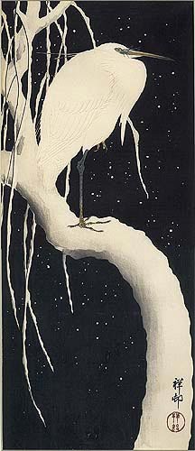
The print above depicts an egret perched on a snow covered willow tree. Though not dated it is assumed to be from the mid 1930s. A dense black background dramatically sets off embossed white feathers printed in a pale reddish-gray. In this work Shôson created a sublime atmosphere of stillness and beauty.


Once again the artist used a black background, but rather than the stark white of the egret above, he has made his swans a creamy presence of elegantly curved necks and orange beaks. The reeds are a greenish-gray, while reflections in the water ripple in that same cream. Title: Geese and Reeds, 1928.


This shin hanga design shows a duck diving under water, the upper portion of its body visible in gray silhouette. Water is shaded with pale blue gray and reeds on the left at top and bottom frame the scene. Title: Diving Duck, undated.


White Herons in Falling Snow is a print from the late 20s, possibly 1927. It shows a lovely grouping of five herons standing against a gradated background that begins at the top with a dark gray night sky growing lighter with the fall of snow and settling at the bottom in a darkening blue. The birds appear to be focused on the drift of falling snow.


From 1928 is the woodblock print Heron in the Rain, and once again the stark white of the bird set off against a nighttime black. The long slants of rain, also white give a marvelous asymmetry to the vertical rectangle of the canvas. The heron here is stylized and captures well the bird’s spirit. The only color is the gray green beak and legs and a dot of yellow in the bird’s eye. Shôson signed this print in that same rain-white.


Again the black and white of a crow against a snowy background. Crow on a Willow Branch in Snow is an early work done around 1910 of a crow perched on a snow covered branch, mouth open in mid-caw. The only dash of color is seen in the crow’s tongue, then reflected in the red of Shôson’s seal.


I mentioned above that the artist painted under different names at times. Above are seven of the signatures and seals we can see today on the paintings of Ohara Shôson.

About Me

My photo
Oak Hill, Florida, United States
A longtime expat relearning the footwork of life in America