Showing posts with label Woodblock Prints. Show all posts

Saturday, November 22, 2014

Rain & Snow: Kawase Hasui

Sometime in the early 1930s, a young man named Robert Muller noticed a woodblock print in a New York shop window and went inside for closer look. He ended up buying the print, using his meager monthly student allowance of $5. The print was Kawase Hasui’s 1931 work, Kiyosu Bridge. Later in his life, Muller opened a print and framing shop in New Haven, Connecticut and became an astute collector who over the years stimulated renewal and development in the art of Japanese woodblock printing.

One of the blogs I always look forward to reading celebrates the old shitamachi district of Tokyo and is written by a young South African woman living and working there. My great enjoyment in her writing (and photos) comes from the fact that I lived in Tokyo myself for 28 years, yet never fail to learn something new in blogposts from Rurousha. A week ago her post opened with a photo of Kawase Hasui’s woodblock print, Kiyosu Bridge. The artist’s name was not new to me and in line with other Japanese art posts I’ve done, with encouragement from Rurousha it seemed a good time to devote some space to this woodblock print artist of the late 19th and early 20th centuries.


Kawase Hasui (1883-1957) was a leading figure in the shin-hanga, or ‘new prints’ movement of Japanese woodblock printmaking. As a young man he studied with Kaburagi Kiyotaka, the man who founded the shin-hanga concept. Hasui traveled frequently, filling sketchbooks with drawings of scenic places around Japan. Many of his print designs are based on his watercolors, many of them done a year or two before the appearance of a first print, but in some cases years, even decades passed between the original work and the print version.

A Tea Plantation, 1941; watercolor in preparation for a woodblock print

Most of Hasui’s prints appear to be based on beautiful, atmospheric watercolors, probably done on location. His sketchbooks include what look like preparatory sketches for either a watercolor or print but it is hard to say much definitively about his creative process as it remains somewhat shrouded in mystery, and for now at least, lacking in very many substantiated facts. Through his teacher Hasui met Shôzaburô Watanabe, a driving force behind shin-hanga printmaking. Watanabe ultimately published most of Hasui’s work.

Daimotsu, Amagasaki in the Rain, 1940

In the print above we see not an old rural Japan but the blossoming industrial Japan of Hasui’s day. Despite that, it is an unmistakably Japanese setting.

Hasui is highly regarded for his exquisite color, perspective and ambiance in a wide range of woodblock prints. Over his lifetime he created over 600 different prints and is recognized as one of most prolific shin-hanga artists of the period. In 1953, the Japanese government decided to commemorate traditional printmaking and commissioned Hasui to make a special woodblock print. The result was Snow at Zojoji Temple, a work later designated an Intangible Cultural Treasure. The year before his death in 1957, Hasui was named a Living National Treasure in Japan.

Snow at Zojoji Temple, 1953

Pond at Benten Shrine in Shiba, 1929

The Road to Nikko, 1930

Cloudy Day, Mizuki Ibaragi, 1946

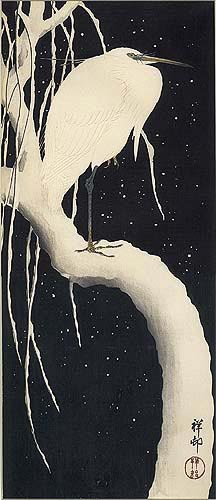
Mandarin Ducks, 1950

Night Rain at Kawarako, Ibaragi, 1947

Dahlias, 1940

The print of Dahlias, along with Mandarin Ducks above are examples of Hasui’s few non-landscape compositions.


For more about the art of woodblock prints see an earlier post here.

Wednesday, July 6, 2011

The Drama of Black and White

A few days earlier space here was taken up with a rare book find on Japanese woodblock prints discovered in a small used bookstore. It could have been nothing less than serendipity that a day after finding this beautiful book, I came across another old book on woodblock prints in another section of the same store, this one focusing on printmakers of Latin America. I missed the book on my first day browsing because it was snugged flat on its back between two larger books on a high shelf. It is a 1946 publication titled, Portrait of Latin America As Seen by her Print Makers and contains 155 illustrations by 138 artists depicting facets of life in eighteen Latin American countries. All the prints are in black and white, which give to them a powerful sense of drama.


The examples presented in the book all have in mind a goal to reveal the temperament and inspiration of both the artists and the region they live and work in. Some is folk rather than fine art, modestly portraying the local scene or characteristics of the inhabitants. In his Introduction, French illustrator and painter Jean Charlot, a longtime resident of Mexico, warns that in order to appreciate the prints one must be aware of the milieu from which they spring, a world quite divergent from average twentieth century ways in Europe and North America.


But rather than relying on explanations or theories that try to translate the artist’s power, better to first of all throw oneself into the prints of these artists and feel for his special vision through nothing more than black ink on paper. Below are four prints that especially caught my eye.


This lithograph is by well known Mexican artist and social realist, David Alfaro Siqueiros (1898-1974). The work is titled simply Profiles. Along with Diego Rivera, Siqueiros was a member of the Communist Party and a well-known artist for most of his life. Accentuation of the angles of the body, its muscles and joints is very often a common feature in the work of Siqueiros, yet this lithograph stands out for the flowing curves of his subject’s face.


The artist is Salvadorian José Mejía Vides (1903-1993) and the woodcut is titled Panchimaco, which is the name of the village in this composition. Vides was a painter and graphic artist who studied at the National School of Graphic Arts in Mexico.


A wood engraving by Chilean artist, Marco A. Bonta (1889-?) called The Baking Oven. Almost an aroma of baking bread lifting off the page in this work.


Italian born artist Victor Rebuffo (1903-1983), immigrated to Argentina with his family at the age of three. He was a graphic artist who studied at the National Academy. The wood engraving here is titled Bread and challenges the viewer to paint his own backstory into the moment between the two figures.

Sunday, June 5, 2011

The Art of Ohara Shôson

An example of Japanese artist Ohara Shôson’s work in the always dazzling blog BibliOdyssey the other day prompted me to show a little more of the man’s work. Oddly enough, he is a woodblock print artist who was always more popular in the US than his native Japan.


Ohara Shôson (1877-1945) was born in the city of Kanazawa, Japan. Best known for prints in the kachô-e style, in which birds and flowers are the dominant subject, his work did at times include paintings of fish and on occasion animals, houses, fishing boats, bridges and women. His work is realistic and based mainly on his own sketches and watercolors. Shôson’s painting began at a time when the ukiyo-e print tradition was waning and the shin hanga or ‘new print’ was yet to flower, however in his later years he returned to woodblock printmaking. The work drew little attention in Japan, but beginning around 1926 Shôson’s prints found great favor in the US and most of his work was exported. At a time when many Japanese had lost any sense of their traditional values, many artists sought markets outside of Japan. The work Shoson did in the mid 1930s is considered his peak, though a large number of his prints were sold at prices below that of his competitors. Over the course of his life Shôson is estimated to have produced more than 450 designs of birds. Some of that work is signed with the name Kôson or Hôson.


Because of his origins as a painter in watercolors and oil, there is a quality to Shôson’s woodblock prints that suggest watercolor. Examination of the detail in a bird’s plumage or a flower’s petals reveal a high degree of craftsmanship. It isn’t unusual to find different versions of the same composition as Shôson was fond of varying his colors.


The print above depicts an egret perched on a snow covered willow tree. Though not dated it is assumed to be from the mid 1930s. A dense black background dramatically sets off embossed white feathers printed in a pale reddish-gray. In this work Shôson created a sublime atmosphere of stillness and beauty.


Once again the artist used a black background, but rather than the stark white of the egret above, he has made his swans a creamy presence of elegantly curved necks and orange beaks. The reeds are a greenish-gray, while reflections in the water ripple in that same cream. Title: Geese and Reeds, 1928.


This shin hanga design shows a duck diving under water, the upper portion of its body visible in gray silhouette. Water is shaded with pale blue gray and reeds on the left at top and bottom frame the scene. Title: Diving Duck, undated.


White Herons in Falling Snow is a print from the late 20s, possibly 1927. It shows a lovely grouping of five herons standing against a gradated background that begins at the top with a dark gray night sky growing lighter with the fall of snow and settling at the bottom in a darkening blue. The birds appear to be focused on the drift of falling snow.


From 1928 is the woodblock print Heron in the Rain, and once again the stark white of the bird set off against a nighttime black. The long slants of rain, also white give a marvelous asymmetry to the vertical rectangle of the canvas. The heron here is stylized and captures well the bird’s spirit. The only color is the gray green beak and legs and a dot of yellow in the bird’s eye. Shôson signed this print in that same rain-white.


Again the black and white of a crow against a snowy background. Crow on a Willow Branch in Snow is an early work done around 1910 of a crow perched on a snow covered branch, mouth open in mid-caw. The only dash of color is seen in the crow’s tongue, then reflected in the red of Shôson’s seal.


I mentioned above that the artist painted under different names at times. Above are seven of the signatures and seals we can see today on the paintings of Ohara Shôson.

Monday, December 27, 2010

Eye on Nature

This season introduced me to an unfamiliar and excellent source of notebooks, scratch pads, cards and calendars. Compared to my friend and cousin, Carolyne, I am a mere novice in this line of goods, and once again she has turned my eyes to a ‘new’ store and artist, Gwen Frostic of Presscraft Papers in Benzonia, Michigan. Until Christmas morning I had never heard of her, the company or the location. My loss, for sure.


Gwen Frostic was born in Sandusky, Michigan in 1906. Until her death in 2001 she shared through her art, books and lectures a very particular and enchanting view of the universe. So impressive were her work and ideas, that in 1978 Michigan’s Governor declared May 23 ‘Gwen Frostic Day,’ and in 1986 the artist was inducted into the Michigan Woman’s Hall of Fame.


Frostic left university at age twenty-one, continuing without a pause her work in metal and plastic arts. The war years brought on a shortage of metal, so she shifted to carving on linoleum woodblocks. She sketched flowers, birds, grasses, trees and dozens of woodland animals and insects, refined the sketches and later cut them into linoleum woodblocks. The result was woodblock prints expressing in marvelous simplicity the Frostic perspective on the beauty and serenity of nature. These prints were applied to calendars, notebooks, cards and books. Thus was Presscraft Papers born.


A poem by the artist offers some insight into her view of the natural world:


Let’s just wander here and there

like leaves floating in the autumn air

and look at common little things

stones on the beach

flowers turning into berries…

From the wind we’ll catch a bit

of that wondrous feeling that comes

not from seeing

but from being part of nature…


The artist’s home and studio, as well as press, are all situated in a wildlife sanctuary in northern Michigan and include a shop built of natural materials designed to bring the outdoors inside. One room with a large fireplace and natural fountain offers a view of the twelve Heidelberg presses printing the artist’s designs onto cards, notebooks and calendars.


A part of my Christmas blessing this year was a Gwen Frostic calendar and a notebook. Completely new to me and I sat for a long time turning the pages of each. At first I worried that the paper in the notebook might not be fountain pen friendly, but that proved a needless concern; four different pens, four different inks all turned out a beautiful match with the paper. An effort to find out anything specific about the paper used by Presscraft for their cards and notebooks came to nothing unfortunately.


Should the time come when stationery goods feel like the right gift, turn your search to that corner of Michigan where one native artist found a woodland universe to illustrate in woodblock prints.

See it all here.

About Me

My photo
Oak Hill, Florida, United States
A longtime expat relearning the footwork of life in America