Showing posts with label Lamy 2000. Show all posts

Friday, July 1, 2011

Laughing Out Blue

Among the fountain pens that I keep inked and lined up ready for use is a Lamy 2000, a pen I consider to be a hallmark in design and stripped-down functionality. The design is simple and inarguably beautiful in its uncluttered matte black and silver. It writes every time in a smooth and flowing line and cleaning, filling and maintenance are all trouble-free. In 1966, when Gerd Alfred Müller handed over to production his designs for the Lamy 2000 a new star joined the ranks of fine writing instruments.


A detailed review of the Lamy 2000 appeared here in March of 2010, shortly after receiving the pen as a gift from longtime friends. I was smitten with the pen from the very beginning, but the months since have deepened my liking and appreciation of Müller’s design. Unfortunately, a stupid accident on my part interrupted regular use of the 2000, and caused it to be sidelined for some time. As a part of his minimalist design, Müller used a small cap ring with two tiny ‘ears’ protruding slightly from the lower barrel as a means of holding the cap on. This cap ring is only visible as two silver ridges hardly noticeable at the grip point of the barrel. The pen unscrews at that spot, separating nib and feed from the upper barrel. At a time I can’t remember, I lost that small, thin cap ring when I had the pen apart for cleaning—a piece so tiny I failed to notice its absence. I reassembled the 2000 and laid it aside. The next time I picked it up the cap fell off in my hands. It took a while but I finally figured out the problem was that missing cap ring. With a cap forever falling off, I decided to give the pen a rest until I could get a replacement cap ring.
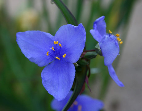

A new cap ring arrived yesterday from a friend in Japan and put my 2000 right back into action. (Anyone in the US with a similar problem, try here.) Simple part, simple fix and now the pen is laughing out blue. I looked through the bottles of Iroshizuku and settled on Tsuyu-kusa, a color too long out of circulation around here. More often than not blue inks don’t light much of a spark for me, but there are a few that fit the mood at times and the Iroshizuku Spiderwort or Dayflower is one of those. About the name, the Japanese tsuyu-kusa is literally ‘dewflower’ but the blue spiderwort is a good match for the color and some use that flower’s name. I have an idea that the ink blenders at Pilot might have chosen the name from a passage in Japan’s classic, The Tale of Genji — “It was true then: he had after all the shifting hue of the dewflower. She had heard about that. She had heard, albeit in general terms, that men were good at lying, that many a sweet word went into the pretense of love.” The dewflower, or dayflower, with its bright blue petals open at dawn and wither at dusk, making it a suitable analogy for fleeting affections. The pretty plant is quite hardy and can often be seen thriving along roadsides.


The Tsuyu-kusa and the Lamy 2000 sample is a selection of four tanka poems by Tawara Machi from her collection, Salad Anniversary.

Wednesday, March 9, 2011

On the Lam

Hard to know when a typical Tuesday might turn into a day you’re on the lam from the police at one moment, and the next sifting through chicken bones and coffee grounds looking for a lost something and then being wowed by the gift of a great looking fountain pen from Taiwan. At least by this point later in the day I’ve stopped looking over my shoulder for flashing lights and cars bearing a big gold star on the doors. I’ve washed the grease and grounds off my hands, and sit now admiring the look and feel of a new TWSBI Diamond 530 fountain pen.


On the way to the airport to pick up a visitor from Japan I got to the toll booth with too few quarters. The change-only toll fee is $1.50 and I was stuck with only five quarters at an unattended booth and a line of cars behind me, the lady in the nearest one signalling ‘Duh!’ The machine won’t take bills and I’m out of change so I hit the gas and screech off down the highway. I mean, what are you gonna do?


Later…Safe from the law and relaxing in the living room with my houseguest, he picks up a Lamy 2000 from the coffee table, looks it over and asks where the silver ring is that holds the cap on. I explained that it had somehow ‘disappeared’ and since then the cap has been falling off too easily. He drew a picture of what the small ring looks like and I suddenly felt like a replacement for the Three Stooges. Yesterday I was cleaning under a table, found a small silver ring that rang no bells, didn’t look at all familiar, so I threw it away. It was the cap ring for the Lamy pen my friend had just drawn a picture of. Spent thirty minutes sifting through garbage and came up empty-handed.


No such thing as a Japanese houseguest arriving without a bounty of gifts. Because I had asked, the five Life Noble Note Plain (unlined) notebooks were no surprise, but on top of that was a TWSBI Diamond 530 fountain pen. I’ve read a little about this pen but still know next to nothing about the history and design. It’s made by a Taiwan company and from information on their website the TWSBI team listens very carefully to suggestions from fountain pen users worldwide, and are very responsive to input. The name TWSBI has an interesting story, but I will wait for another time to write about that along with my first impressions of the Diamond 530.

Monday, October 4, 2010

The AL-Star Lineup

No question, I love my Lamy fountain pens. I’ve been using a Safari since December of last year, and a 2000 since March of this year. Both pens have brought nothing but complete satisfaction and continued admiration for Lamy design and engineering. True, I am not the biggest fan of steel nibs, but I’ve adjusted to my Lamy nibs over the course of using them. I have great respect for designers Wolfgang Fabian (Safari) and Gert Müller (2000), and am also a big fan of the Bauhaus principles of functionalism and simplicity.


The spotlight here is on what some call the upscale Safari, the pen introduced by Lamy in 1997, the AL-Star. Anyone looking at the AL-Star will see immediately that it bears close resemblance to the hugely successful Lamy Safari. The AL-Star was in fact designed by the same Wolfgang Fabian of Lamy fame. But he has made two noticeable shifts in the AL-Star design, perhaps both in the hope of giving the pen a high-tech look and feel. Side by side, the AL-Star is bigger than the Safari, but not in length, and not in weight. It’s the diameter that is bigger, and a close look at the caps end-on makes clear the difference in size. The other shift comes in the material. Unlike the Safari, which is crafted in plastic, the AL-Star is lightweight durable aluminum. I have the polished matte aluminum model, but it also comes in five other colors: coffee, blue, graphite, green and ocean blue. As for the shift to durable lightweight aluminum, Lamy indicated that they hoped to link the AL-Star with the prestige of high-tech industry. I would say they succeeded in that. Certainly, the designer has achieved the look and feel of high-tech. Despite the almost 100 year history of Bauhaus design as envisioned by Walter Gropius, the Lamy design looks as fresh as tomorrow’s bread.


Consider the ergonomic design of the AL-Star’s grip. Unlike the upper body, the grip is made of smoky-transparent plastic and ends in sculpted finger pads. The pen is amazingly comfortable in the hand, and at the same time provides grip-guidance for young, inexperienced users. Here again they succeeded, if we are to believe the Lamy label, which calls it “The most successful young person’s pen on the market.”


Like the Safari, the AL-Star measures 5.5 inches capped, and at 6.7 inches posted, is slightly longer than the Safari. The nib on the AL-Star is black chromium-plated stainless steel. It comes in extra fine, fine, medium and broad. The cap does not screw on, but clicks into place, and posted maintains a strong airtight seal. The top of the cap has cross-shaped slots cut into a black plastic disc, almost like a Phillips-head screw. I inserted a dime and turned it, but nothing happened. The clip is a repeat of the Safari design, black painted spring brass wire in the distinctive broad upturned design. The pen takes either cartridge or converter and the barrel has an ink window, which I find somewhat hard to read in terms of ink level.


Overall, the AL-Star is a tough and rugged design, with young users in mind, and only slightly expensive for a start up pen. It lists for about $40, but a better price is available from several dealers. I call the pen slightly expensive because the best priced start up pen in my opinion, is the Pelikano Junior for about $10-12.


Performance wise, the AL-Star is okay, but I am more comfortable with a medium nib, and feel the scratchiness of a fine steel nib a little bothersome. My other Lamy pens are medium and the feeling is smoother, more comfortable, providing a better flow of ink. Writing with a full cartridge I still get the feeling that the ink is low. Little wetness to the fine nib on an AL-Star. Unless you have a real bond with fine nibs, I recommend a medium. Hard for me to imagine what the AL-Star extra fine nib must be like.


Considered all around, I have to echo other opinions and say that the Lamy AL-Star represents good design, good engineering and strong manufacture. Great pen for a high school student.


Look here for earlier reviews of the Lamy Safari 1, Safari 2 and Lamy 2000.

Wednesday, August 11, 2010

From Red to Red


In writing to a friend recently I chose to use a custom mixed ink from Osamu Ishimaru at Sailor, an ink first called ‘Dried Persimmon’ but later changed (by me) to 'Blood Orange.’ (The second name seemed more fitting.) Some days later, in a reply to my letter, my friend commented that the Blood Orange ink looked very much like the new Rouge Hematite 1670 ink from J Herbin. I am usually sensitive to ink colors, and quick to note similarities in different inks. I have a bottle of the Herbin 1670, have used it frequently, but still had not noticed its closeness to the older Sailor ink I call Blood Orange. Suppose it was a case of not using the two inks back to back, or maybe I just wasn’t paying attention. But I did notice the likeness of the two colors immediately upon reading my friend’s comment.

I can’t remember exactly when it was that Mr Ishimaru mixed the Blood Orange for me, but I think it was sometime in 2008 at a pen fair in Tokyo’s Maruzen Department Store. I have old journals with a good many pages in the Blood Orange ink, but it hasn’t been in my ink rotation in recent months.

A comparison might be of interest to some, so that’s what you see here. Apart from Q-tips and brushes, the two fountain pens used in the photo sample are: Sailor Naginata with a medium nib for the Herbin 1670 (left), and Lamy 2000 medium nib for the Sailor ink (right). The paper used is Vélin Blanc Clairefontaine Triomphe, 90g. The Sailor is slightly darker than the Herbin, perhaps with a dollop more black. The Herbin has a pleasing brightness that the Sailor Blood Orange lacks, but at the same time, the shading is better in the Blood Orange. Saturation appears to be in favor of the Rouge Hematite. The two inks have a similar drying time; I tested each after a ten second wait. Neither of the inks is waterproof, but if I had to write in the rain I would opt for the Blood Orange. Under water, the Herbin loses all character, all that distinguishes it from ordinary red ink, while the Sailor turns purple, though manages to hold the letter shapes.

For those who might be interested in buying the Sailor ink, you will need to give Sailor and Mr Ishimaru the following blend number: 070112059. Most likely in Mr Ishimaru’s records, the color is identified as ‘hoshi-gaki’ (Dried Persimmon).

About Me

My photo
Oak Hill, Florida, United States
A longtime expat relearning the footwork of life in America