The only thing that surprises me about the heightened interest in sepia and other brown inks that has flared over the past year is its lateness in coming. There was a time centuries ago when sepia ink was the norm, as common as royal blue ink is today. But then fads change and eventually traditionals are replaced with something deemed more right for the time. There is probably a good chance that royal blue ink will fall out of favor, to be replaced with another sober and conservative color of ink suitable for business documents and important signings. It might even turn out to be a return to sepia-like browns.
I’ve had a thing for brown inks for some time, and back when there were few to choose from among available stocks I had them mixed by Osamu Ishimaru, premier ink blender at Sailor. The opportunity to have custom inks mixed on the spot is something I lament about no longer living in Tokyo. In a city the size of Tokyo, where fountain pen and ink hobbyists are well served by pen clinics and festivals occurring several times a year, and where pen shops are numerous, the events and opportunities provide a near paradise for pen and ink enthusiasts. Sadly, where I live now it’s an Internet fueled hobby for the most part. Can’t say that has cured me of a mania for ink. A new ink, manufacturer or shade still has the power to set heartstrings humming.

The other day I pulled from an out of sight corner in my stacks of ink a shade of brown mixed for me by Sailor’s Mr Ishimaru maybe fours years ago at a pen clinic sponsored by Maruzen Department Store in Tokyo. At this remove it’s hard to recall my description of the brown I was looking for at the time, but surely it was something ‘woody, darkish and robust with a hearty splash of black.’ Whatever the description at the time, Mr Ishimaru as always was game for a mix and match, dip and dab search for the desired shade. The result was an ink that he suggested we call Capricorn. No idea where he came up with that name but it suited me fine. I still have a bottle half full of that woody, robust and blackish brown Capricorn.
Not a lot of critical commentary this time, but more a sampling of what the color looks like. Sailor Jentle Ink is well represented among the bottles on my shelves and I honestly cannot recall even one among them disappointing in terms of saturation, shading, purity and smoothness. If you look at the 1-3-5-7-9-10 drying time samples in the top photo, it’s clear that this Sailor ink at least is not especially quick drying. Even after nine seconds some wetness remains, though ten seconds are enough for non-smear dryness.

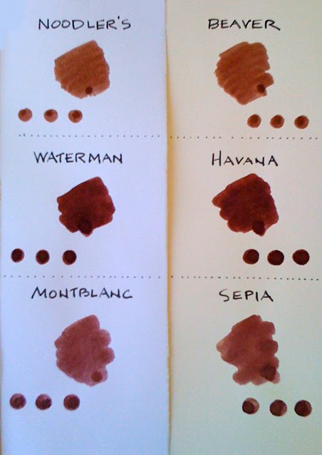
But look at that chocolate pudding richness in the swab in the top photo. It looks quite different from the Capricorn in the comparative brown swabs in the second picture. Fact is, the ink looks much, much better in lines of script on a page than in any quick and doubly saturated Q-tip swab. A page full of writing in Sailor Capricorn ink is a beautiful sight.
For us here in the US, the ability to acquire this ink is not so easy, since Sailor doesn’t send its ink blenders on tour to America. But for those living in Japan the difficulty evaporates when you have the ink’s mix code and the chance to attend one of the many pen clinics in most large Japanese cities. The mix code for Sailor Capricorn is: 070313031. Give this number to any Sailor ink blender and he should be able to mix up a bottle of Capricorn in about ten minutes.
The writing in the top photograph was done with a Pelikan Souverän M1000 with a broad nib.