Showing posts with label Clairefontaine. Show all posts

Friday, October 29, 2010

Shoe Polish for Beavers

About the recent thread of autumn tinted inks in these pages, today is something like a U-turn, a looking back at the brown I jumped over last Tuesday. That particular brown is NOODLER’S BEAVER, and at this point, after an hour or two of playing with the ink on two different kinds of Clairefontaine paper, in a Sailor Professional Gear fountain pen with medium nib, and with Q-tip, I have to say in all honesty that I am only moderately impressed.


Like green, brown is another color I’ve chased after for a long time, always searching for the one that fits my preferences as closely as possible. In that search I’ve found three that fit the bill, three that I’m happy with, but those inks are not on parade here. The spotlight this time is on Noodler’s Beaver.


The color—Let me say right off that all the red in the Beaver works to push the shade toward what I call shoe polish brown. There will be some who like this particular reddish Shinola brown, and for them I would say go for the Beaver. But memory works against me, as I am reminded of the Saturday nights I had to polish my father’s shoes for church on Sunday. While it isn’t my kind of brown, the same is not true for everyone, and Noodler’s Beaver could be the one for you.


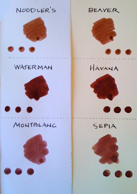
I lined Noodler’s up alongside two other browns and found all three to be close. Side by side, Noodler’s Beaver, Waterman Havana and Montblanc Sepia (Toffee Brown) almost look to be from the same ink pot, or the same shoe polish bottle. So close in fact, you might have difficulty in telling them apart. Feel like I would be stumped if you showed me unlabeled samples of the three tomorrow.


Brian Goulet has some good things to say about the Beaver, and I tend to agree with his remarks about the shading of the ink. Yes, it does shade well, and it also flows smoothly. With my Sailor pen at least, it lays down a line of well-balanced wetness, neither too wet nor too dry. In this sense, I found the drying time reasonable, but must caution left-handed writers that drying time could be a problem.


Everyone has this or that little something that draws them to a particular brown, or green or any color ink. Experience has taught that an ink displaying the finest of all qualities is rare. I have to think that getting it all right is a matter of delicate balance. Noodler’s Beaver has some excellent qualities, but the color, be it autumn or otherwise is not what I look for in a brown ink.


In my book the three top brown inks are: Maruzen’s Athena Sepia, Iroshizuku’s Tsukushi and Yama-guri. All the qualities we look for in ink are superior in these three. They are examples of that delicate balance personified by the harmony of color and performance.

Tuesday, October 26, 2010

An Oddly Named Beauty

Got a feeling that I’m moving backward on the autumn colors with today’s look at a GREEN ink. Anyone might have guessed that after pumpkin, orange crush and red would come brown, or something close, and I did actually consider writing about a brown ink. But I got blindsided by a green ink new to my eyes, and as chance would have it, I have sort of a thing for green inks.


I still think of Diamine as an ink new to my fountain pens. It is not marketed in Japan—or at least it wasn’t when I was last there several months ago—and my Diamine experiences before today were limited to Sapphire Blue, Syrah and Pumpkin. One quick look at Diamine Umber was enough to send a bottle to my Brian Goulet shopping cart. Like I said, I have a passion for green inks, and Diamine Umber is pretty much a green unto itself. I lined it up beside six or seven other related greens and none of them are a close match. I would say the closest match is Conway Stewart Green, but where the Diamine Umber employs a touch of gray to tweak the green, Conway Stewart shows a hint of blue.


‘Umber’ has to be called an odd choice for the name of a color that, simply put is not umber, and not even close. True umber is an earthy brown showing no trace of green. On the other hand, Diamine Umber ink is an earthy green showing no trace of brown. Go figure. But let me be clear on this point; forget about the name and feast your eyes on this remarkable mix of green. I don’t really care for the word, so rarely use it, but the Diamine Umber is gorgeous. I ordered a bottle from Goulet Pens on Saturday, and Brian got it to my mailbox on Monday morning. How’s that for service? —and including still the handwritten note of thanks for my order.


Filled one of my favorite pens with the new Umber, a Sailor 1911 Large, medium nib re-crafted by John Mottishaw of Classic Fountain Pens. Putting the pen to a sheet of Clairefontaine 90g paper I was impressed from the first line. The Sailor 1911 is a wet pen and handles the Diamine ink very well, with a beautiful shading. I wouldn’t describe it as a very saturated ink, and it certainly produced no show through on my sample. The result was not so good on the few lines I tried using cheap copy paper. The shading was still good, but the bleed through was nasty. I’m thinking that Diamine Umber is an ink to save for better grades of paper.


The review of this Umber by John Gill on Ink Nouveau offered an interesting waterproof test I wanted to try myself because the set up was one familiar to us all. You’re writing in your journal or otherwise in a coffee shop or café and a drop of water spatters your page… What happens? Grab a napkin and blot the already dry Diamine Umber and the result is a word, or words still legible, small mess, no problem.


In looking at definitions of the word ‘umber’ as it applies to this ink, I found one description that bordered on what I see in this earth tone green. Somewhere in the world lives an Umber Moth brownish gray in color, a coloring that resembles tree bark. Reading that I thought, forget the moth and imagine instead the moss or lichen that we sometimes see growing on tree bark. In that lichen I can see the beginnings of Diamine Umber.

Saturday, October 23, 2010

Noodler’s Nod to Autumn


Apart from a change in the air, the crispness and the transition to a gentler time of year, color has always been a trademark of autumn. Leaving aside the fun of Halloween and the family warmth of Thanksgiving, most of us have associations that link color to the season in a strong way. During my years in Japan, a country almost as famous for its autumn foliage as the springtime pink of flowering cherry trees, for me the strongest and most enduring color image of autumn was the persimmon, the bowls of vibrant orange fruit, the persimmon trees bowed with globes of ember. But that orange is as transitional as everything else, and soon slips into darker shades. We see it as a cycle slipping from green to yellow, orange to red, and finally red to brown.


In the past week my thoughts have centered on orange, on two autumn-tinted inks, Pumpkin (from Diamine) and the slightly darker, more shaded Orange Crush (Private Reserve). As the passing days affect the autumn palette, so my thoughts turn to another signpost of autumn—RED.


There is no shortage of red ink in the neighborhood of my four walls. As I write this, the number of bottles—red this and red that—number around fifteen. But then, most of us ink junkies have too much ink to ever use in a lifetime. Ask Julie at Whatever and she might tell you the same.


Today’s featured color is Noodler’s Red, a shade that I think of as less than bright red, with no hint of the orange seen in the very reputable Sheaffer Skrip Red, yet none of the darkness in Noodler’s Rattler Red. The best quality of the Noodler’s Red is the absence of vibrancy, the look of an almost dull red that is moving toward, but not yet a dark red—one step in the turning cycle from red to brown.


Not a whole lot of shading in this autumny red, but enough to keep it from blandness. It flows smoothly from the Pelikan 200 I used for testing, and I wasn’t bothered by the time it took to dry. Left-handed writers will have trouble with the drying time, I suspect. My test was on 90g Clairefontaine paper, so feathering or bleed through were not an issue. Even for the very wet Q-tip swab, the show through was minimal. This is a fine ink, and should get some notice from those with a fondness for reds.


For a more detailed review of Noodler’s Red, once again I will point you to Brian Goulet at Ink Nouveau.

Thursday, October 7, 2010

Steeped in Orchid

I never win anything. When I got word the other day from my friend Julie at Whatever that I won her Wancher ink giveaway, I figured something went wacky with the stars and planets. Maybe the moon is in the seventh house, as the flower children used to say. Such a rare phenomenon, I almost emailed Julie to say she’d better have Vanna White spin the wheel again just to be sure.


The ink arrived today, and I’ve been playing with it for the past couple of hours, testing it, comparing it to similar inks, and generally getting my hands so messy it looks like I’ve been squishing grapes in my hands. The ink is from a seller in Tokyo who makes (at least for now) only five colors: Matcha Green, Asuka Brown, Tenmoku Black, Imari Blue, and the one I have here, Ebine Violet. Believe it or not, he sells a 50cc bottle for $3.50.


The ‘violet’ in the ink Wancher has named Violet Ebine tôyôran was inspired by the purple of the Calanthe orchid. Let me include a brief of the explanation found on the Wancher ebay site:

‘This purple is the color of the Japanese tôyôran, which is ‘Calanthe orchid’ in English. In Japan the orchid has a long history dating back to the Edo Period (1600-1867). Orchids were loved by the rich nobles of the time, and the plants were often covered by a gold or silver net for protection. Flower viewers were required to cover their mouths with paper so as not to breathe on the orchids.’


Personally, I like very much the orchid-like beauty of this Wancher Violet Ebine. From first glimpse I recognized it as an ink I would go back to again and again. The only thing is, color and shade wise, there is not really anything to call completely individual about the color. In no time at all I pulled five other colors from my ink shelves that bear a close resemblance. But in saying that I intend no criticism. These days, it is quite difficult for even the top ink makers to come out with a color that is totally individual. Just too many out there, from Diamine, Noodlers, Private Reserve and J Herbin, to expect that one of them will release a never before seen color of ink. Subtlety, nuance and a hint of native color are what we can expect in the ink market of today. And of course, an ink that behaves well in more than one pen, on more than one kind of paper.


At first look, I thought the Wancher Violet Ebine resembled Private Reserve’s Plum. A little longer look and I thought of PR’s Arabian Rose. So, I decided to line up five inks beside the Violet Ebine. As it happens, all five are close enough to fool even the likes of Brian Goulet. The six inks in the photos here are from top to bottom:

(1) Private Reserve Plum

(2) Private Reserve Arabian Rose

(3) Diamine Syrah

(4) Wancher Violet Ebine tôran

(5) Iroshizuku Yama-budo

(6) Iroshizuku Tsutsuji


I call the Violet Ebine beautiful, but amidst such close similarity we have to consider performance. The best way to get a well-rounded feel for the ink was to try it in three different fountain pens, on three different kinds of paper. So that’s what I did.


(A) Montblanc Meisterstück Doué on Life Noble Note cream paper—The pen moved smoothly across the page, laying down wet, but unshaded lines of ink. Noticed right off that nib creep is a problem with this ink, in this pen. On this first test, I found the Violet Ebine comparatively fast drying.

(B) Pelikano Junior on Clairefontaine 90g paper in a Rhodia Webbie—The pen and ink both move well together on this paper. However, shading is almost non-existant. The flow of ink is good and not so wet on this thicker, richer paper. Drying time not quite as fast as the first trial.

(C) Waterman Carène on white Clairefontaine Triomphe stationery—Again almost no shading, and once more a case of nib creep. Drying time is the slowest on this paper. The Carène flows smoothly with this ink, wet, but not so much as on the Noble Note paper.


I might hesitate to say that the Wancher ink is performance wise in the same category as big name inks like J Herbin and Montblanc, or Diamine and Pilot Iroshizuku, but this Violet Ebine tôran from Wancher is not at all a bad or inferior ink. I rather like it and expect it will have its share of use in my fountain pens. If you’re partial to purple, or near purple inks, this one might be for you.


And thanks, Julie.

Thursday, September 30, 2010

Phileas Fogg’s Namesake

Starting to reach bottom in the collection of fountain pens entrusted to me for cleaning and evaluation by a friend. Today I looked at pen number eight, a Waterman Phileas in red marble, a design from the 1990s. The pen is named for the character Phileas Fogg in Jules Verne’s 1873 book, Around the World in Eighty Days, and from that name Waterman has managed to spin a tale connecting pen and book. (Neither Waterman nor fountain pens existed in the 1870s, of course.)


Waterman, along with several of their vendors like to say that the Phileas reflects the art deco look of the 1930s, but that claim is something of a stretch. This pen has what anyone would call a handsome design, a traditional design, but it does not really evoke anything of the art deco era. The barrel and cap are plastic resin with a brass liner. The ebony black crown on the cap looks especially good with the gold band and pocket clip. The Phileas comes in several colors. There is the solid black model, and then the designs in faux marble finish, either blue, green or red. The nib, in either fine or medium is a wide two-toned, partially gold-plated steel nib, with a gold fan motif just over the usual Waterman hexagon with ‘W’ in the center. This gold fan motif is repeated on the pen’s barrel band. The Phileas uses either cartridge or a Waterman piston-fill converter.


I have heard the pen described as a good starter pen for the beginning fountain pen user. You can never be sure how cheaply a certain pen will sell for on ebay, but buying the Phileas brand new is a little more expensive that what most beginners want to pay. Not too long ago I mentioned to a non-enthusiast that a certain pen cost only $60, and the reaction was closer to shock than pleasant surprise. My opinion is that the Waterman Phileas is too expensive to be called a ‘starter pen.’


To be brief, the Phileas fine point nib I have here writes well, rather closer to medium than fine. It’s very smooth and wet enough, though not too wet. The feeling is unlike other steel-nibbed fountain pens, or at least that was the case in the one page I wrote using Iroshizuku Ajisai (hydrangea) ink. Good behavior on the 90g Clairefontaine paper with this ink. I have to give high marks to Waterman for this good looking, smooth writing and moderately priced fountain pen.

Saturday, September 18, 2010

Ink from the Keel

My experience with Waterman fountain pens is limited. I own only one, and it isn’t a pen I use too frequently, earning a place in my collection by its very unusual black and white checkerboard design that includes a broad orange stripe down the barrel. It is a 2000 model in the Waterman Harley Davidson Free Wheel Racing series. A good looking fountain pen, but my patience with the stainless steel nib was short lived.


Trying my hand at a Waterman Carène turned out to be a very different experience, and a pleasant surprise. Another of the pens I am evaluating for a friend, this one had to wait a couple of weeks to have its turn. Anyone with an interest in Waterman will know that the Carène is a very popular model, and that it comes in several variations. The one I am trying out today is the Carène in Marine Amber, called by some dealers Amber Shimmer. Waterman’s own description of this is typical ad agency copy: ‘Deep undulating browns and blacks mixed with the seasoned richness of gold-plated trim evoking a timeless elegance.’ Take a little of the pizazz and exaggeration out of that statement and what you’ll see is a barrel and cap in satin lacquer finish of brown marbled amber, enhanced by a gold plated pocket clip and trim. And my redaction of Waterman’s hype is not meant to imply this lacquer finish and gold trim might be anything less than beautiful. Most wouldn’t hesitate to call this a handsome fountain pen.


But if there is to be hype, to my eye, the pen’s attractiveness stems more from the overall line, the design of the pen’s shape. Fulfilling the nautical image implied by the name Carène—an old French word for ‘keel’—the designer envisioned the line and grace of a racing yacht, flowing from one end to the other with the least interruption. Begin with the top and what Waterman calls the ‘button,’ a slanting gold form echoing the curved stern of a yacht. From there the eye flows uninterrupted to the inlaid nib over a curving bottom, which can be seen as a yacht’s bow slicing into the waves. This nautical line is what Waterman means when they suggest ‘timeless elegance.’


Not a large pen, the Carène measures 14.4cm capped, and at 14.7cm posted is not a great deal longer. The weight is a comfortable 33 grams. What is noticeable is that the pen is slimmer than average, or maybe sleeker would be a more fitting description.


The inlaid nib is rhodium-plated 18k gold, and in the case of this pen, medium. Most interesting about this nib is the absence of an ink hole on the top. Instead, it is located behind the nib, on the underside of the pen, and 1.5cm up from the tip. The pen uses either a cartridge or converter filling system.


In my writing test, the pen performed beautifully. Smooth flowing without a hint of skip. The inkline is consistent throughout the stroke, either up, down or curving. I have my favorite pens and preferred nibs, and while I won’t say the Waterman Carène puts them in shadow, it definitely is a pen I would buy without hesitation. It writes well.

For the test in the attached photograph I used Waterman Havana ink on Clairefontaine 90g paper.

Tuesday, August 24, 2010

Rhodia Perfection

For a long time I have happily used for my journal writing a Japanese made ‘notebook’ called Life Noble Note Plain. I like the size of five and a half inches by eight and a quarter inches, as well as the thick unlined ivory pages. I also like the brown cover with its old-fashioned design. Several months earlier, at the time I was living in Japan, but making plans to leave there, I bought five of the Life notebooks to take away with me, certain I would be unable to find the same brand here in the US. But that stack of five has dwindled, and I’ve had my eye out lately for a replacement.


And then came Rhodia. I read a couple of reviews on pen & paper related blogs of the new Rhodia Webnotebook. It looked good and right off impressed me as a likely replacement for my longtime Life notebooks. I’ve had good experience with Brian Goulet at gouletpens.com, so I ordered from him the larger of the two Rhodia Webnotebooks, which just happens to be the exact size of the Japanese Life notebook I’ve always used.


My order arrived amazingly fast, and as is usual with Brian, included a handwritten note of thanks for my order, finished off with a wax seal. To my mind, the note is a special touch. But to the point, the Rhodia ‘Webbie’ as it has come to be called…


I chose the orange (tangerine) cover because I wanted to expand my range of colors, journal-wise. The Rhodia orange is beautiful, but it isn’t until you hold, touch and feel the Italian leatherette cover that the color comes into full bloom. The best way to describe it is to say it is something I want to hold onto. It feels good in my hands, and moving my fingers over the leatherette is almost a soothing sensation. It certainly makes me wonder what exactly this ‘Italian leatherette’ is. The Rhodia logo in the center complements the notebook’s softness.


Another thing I like is the rounded corners. No matter how you turn or hold the Webbie, there are no sharp edges. Everything about it is smooth and silky, and that includes the 90g ivory Clairefontaine pages inside the cover. The Clairefontaine name is enough to tell you that the paper is going to be of superior quality. The Webbie has 96 blank (or lined) sheets, or 192 pages. The paper is acid-free, pH neutral and PEFC-certified.


One add-on at the back is a great idea, one I’ve seen in Japanese notebooks. This is an inner pocket just inside the back cover, perfect for small notes or clippings, maybe business or personal cards, things you want in a journal that aren’t written on the pages.


The notebook also has an attached elastic band which offers protection from other things getting wedged in the pages while in your bag; a simple band that keeps the book closed when you want it closed.


So what about the paper inside, the Clairefontaine 90g? Hard to imagine that anyone could ask for better. For my first bit of writing I chose five different fountain pens and five different inks. Each one proved to be a beautiful marriage of ink and paper. Smooth, clean, no feathering or bleed through, satisfying in all its qualities—what I would call ideal or perfect for pen and ink.

PENS AND INKS USED

Lamy 2000 (M) • Sailor Blood Orange ink

Lamy Safari (M) • Waterman Florida Blue

Pelikan 200 (M) • Sailor Miruai

Pelikan Souverän 600 (M) • Iroshizuku Tsukushi

Pelikan Souverän 1000 (BB) • Montblanc Violet


It’s just a matter of time until I order my next Rhodia Webnotebook. I’m hooked.


My thanks and appreciation to Brian Goulet at gouletpens.com.

Tuesday, July 27, 2010

Exacompta Journal

Back in May, when I got a bottle of J Herbin 1670 Anniversaire ink from WritersBloc, I also got one of the Exacompta Club Leatherette journals, the ones that come in nine different colors, each an unusual and eye-catching shade. In writing a review of the Herbin ink, I mentioned the journal and promised to write more about it after having the time to give it a good trial, a good testing. Not really fair to say a whole lot about a journal before having the occasion to see how it reacts to, or interacts with your pens, inks and personal style of journal keeping.


The Exacompta journal measures 5x7 inches, with 192 pages of premium Clairefontaine 64 gr paper. Many of us are already familiar with Clairefontaine paper, but let me quote from the insert that came with the journal: ‘…the best paper in the world for writing. Our paper is chlorine-free. A gift of nature, a mineral called calcium carbonate, gives Clairefontaine paper its famous qualities of extra white paper and ultra smooth…We manufacture our own paper from sustainable forests with minimal environmental impact.’ I am unable to say much about calcium carbonate and sustainable forests, but the whiteness and smoothness are unmistakeable and make an immediate impression. I chose the mandarin orange leatherette cover, but the choice was not easy with the impressive collection of colors to choose from. While Exacompta and Clairefontaine are both French, these journals are labeled ‘Made in the USA’ and interesting to me, the leatherette cover has a large sticker inside saying, ‘Made in Poland.’


I mentioned back in May that the journal is a wee bit smaller than the A5 (5.8 x 8.3 inches) size I prefer. That doesn’t seem like a big difference from the non-standard 5x7 inches of the Exacompta, but the difference is immediately noticeable to one accustomed to the larger A5 standard. Unluckily for me, the Exacompta size will weigh heavily when time comes for a refill. But I realize the size issue may not be as critical to other journal keepers, and this is the only point I can find to grumble about.


The paper is everything and more that Exacompta says about it. Looking at the bottom photo showing the open journal, some might see smeared, sloppy pages, but that’s just my style of writing in a journal—usually smeared, crossed-out, tilted, stamped and multi-colored. For those who like neater pages, the Exacompta will serve beautifully.


A product I can happily give high marks to. Check it out at WritersBloc.

Monday, May 24, 2010

Blood, Dirt & Sunlight

Received the order from writersbloc.com yesterday, the Exacompta journal and the J. Herbin Rouge Hematite. After opening the box I put ink and journal on the table to look at throughout the day. The Herbin ink is a magnificent presentation and the box is an example of smart and classy antique design, lovely to look at and admire. But the Exacompta journal has its charms as well and doesn’t hide in the ink’s shadow. The leatherette cover is a striking red orange described as mandarin. While the first day may have been for just looking, today was hands on.


They call it Rouge Hematite. The first part presents no problem, but the hematite part is a little deeper. Hematite is a mineral which can be red brown, and is important in iron. It gives the ink that rusty terracotta look, sort of like a mix of blood, red earth and sunshine, and reminds one of Cormac McCarthy’s landscape in Blood Meridian. Let me get right to it and say that the color of this new ink is a stroke of genius by the J. Herbin ink blenders. The Rouge Hematite is a knockout, and joins with pen and paper to produce near perfection.


For testing the ink I settled on a Sailor Naginata, with a 21k M nib. I rarely have any doubts about this pen and knew it would serve well with the new Herbin red. For paper, I naturally chose the Exacompta journal with its Clairefontaine paper. This was my very first experience with Clairefontaine, and I'm happy about finally trying this top quality paper. The Sailor, the Herbin and the Clairefontaine interact well together. I wanted to try the ink out over several continuous pages, so I opened the Faber-Castell journal and wrote two full pages, front and back. It was there that the Rouge Hematite showed its full potential. Beautiful shading. I didn’t really test the ink for drying time, but the impression was favorable. I’m certain this ink will become one of my regular inks, and I’d have been smart to order two bottles.


But then I’m glad I didn’t order two bottles because I would rather wait for the bottle make-over, due in June according to Quo Vadis. First of all, the sealing wax looks great, but it quickly loses its luster when it begins crumbling around the mouth of the bottle’s very small opening. And what was the thought behind choosing the cheap, easily damaged aluminum top? I was immediately reminded of the cap used by soft drink makers. As I said, the presentation is good, but once you get into the box, it’s all downhill until your pen touches the ink. Hopefully, you won’t get sealing wax in the ink, and hopefully your fountain pen is slim enough to fit down into the bottle.


Overall, my opinion echoes the wording on the box enclosure, ‘…it will bring majesty to your writing.’ Rouge Hematite is five-star ink, little doubt of that.


As for the Exacompta journal, I will wait a while before making too many comments, On the surface, I love the mandarin color, but wish the journal were a little larger. The Clairefontaine paper is good. But it wouldn’t be fair of me to say more at a time when I’ve only written one small page in the journal.

About Me

My photo
Oak Hill, Florida, United States
A longtime expat relearning the footwork of life in America